Don't Cut Borders' Corners
The Setup
Most frontend engineers know the simple trick to make a circle a out of a <div>: set the CSS border-radius: 50%. It's a quick way to cut corners.
The Problem
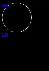
Go to this JS Fiddle and look at the results. There are supposed to be two circles there. There is only one. Here it is for those of you too lazy to click:

That is a problem.
What I Tried
My requirements were simple:
- Circle
- Transparent background
- White border
The first thing I did was create the CSS class I needed with the correct size and border-radius property. Rounded. Need that for the circle-y bit. I also specifically made the circle's background transparent. So, given those two properties, I have an invisible circle.
.circle {
  height: 100px;
  width: 100px;
  border-radius: 50%;
  background-color: transparent;
}
Here it is:
Very invisible.
The white border is where we went wrong here. Very specifically, I want a white, solid border. No need for shorthand. I added this CSS.
border-color: white;
Nothing. Oh, duh, I didn't specify a thickness.
border-color: white;
border-width: 1px;
Still nothing. Take a minute to think about a solution; see if you figure it out.
Why It Was Wrong
I made an assumption. Yea, yea...I can hear the Internet now: "You know what happens when you make an assumption, right?
I assumed when you set a border-width or border-color, there would be some default behavior to display the border. Nope. From the Gospel:

Developers use a lot of CSS shortcuts and I normally use the border shortcut myself. This time, I was so focused on the simplicity of the circle, I didn't think it would be necessary. Wrong.
tl;dr
Either use the CSS border shorthand or set border-style for borders to display.