How to Detect Mobile Devices (The Easy Way)
Spoiler alert:
They're all the hard way. There is no easy way. Kind of. Unless you know Javascript, which I do.
Read through to see my failures. Scroll to the bottom to get a quick answer.
Context
I had a design idea to make my personal splash page like a planetarium. I have always loved the stars since I was a child. Heck, that's why this blog is called "Javascript Universe".
I also revelled in the idea of taking my brain design, drafting it to paper, then turning it into code from scratch. This was also an excellent opportunity for me to learn more about mobile-first design using a framework, such as Bootstrap.
The laptop and desktop version were complete and pretty, but I hadn't quite built a mobile-first website. My UI focused heavily on a hover mechanism. Mobile can't hover easily, so I needed to use different styling specifically for those users.
@media Queries
My first research on detecting mobile broswers led me to media queries.
These tags (@media) detect certain attributes such as screen size, resolution, and even what kind of interaction users can have with their browser.
There are two ways of implementing this:
1) Right in the link.
<link rel="stylesheet" media="(max-width: 800px)" href="example.css"/>
2) In the stylesheet.
    body {
        color: red;
    }

    @media (max-width: 800px) {
        body {
            # color will overwrite the red due to cascading
            color: blue;
        }
    }
Failure #1
My first thought was, "Great! They have must a media query to see if a user has a touch screen!" If they can touch, they probably can't hover, so they must be mobile.
My query looked like this:
@media (hover:none) {
    # change css stuff
}
Bad news: this doesn't actually exist yet. It will soon, and when it does, I will do a happy, happy dance. This method would also, sadly ignores the use case of touch-screen desktops and laptop-hybrids.
Failure #2
I also found some documentation to query what kind of pointer the user has:
- Fine (mouse, stylus)
- Course (finger)
- None (TV)
Those are in the works too, but not available yet.
Failure #3
I'm kind of desperate at this point. I think I'll just go with the absolute worst practice, which no single person on the internet suggests: min-width.
Ok, so I didn't do that. But I almost did.
The problem is, phones are huge these days!

While the phones aren't physically larger than my laptop, the sheer number of pixels they pack onto a screen confuses browsers into thinking they're not mobile devices.
Failure #4
I jut wanted to see what styling I would theoretically change if I found the correct media query, so I put this at the top of my index.html page.
<link rel="stylesheet" href="stylesheet.css"/>
<link rel="stylesheet" media="(min-width: 0px)" href="mobile.css"/>
The idea here is that I will load stylesheet, then mobile will kick off due to my ridiculous query; everything has a minimum width greater than zero. Well, mobile loaded alright, but the styles never cascaded down.
From MDN:
"When a media query is true, the corresponding style sheet or style rules are applied, following the normal cascading rules."
I followed all the tutorials.
I reached out to fellow hackers who doubled-checked my cascading.
It should have worked.
(That magic, 's' word)
Javascript For the Win!
Despite being a full-stack Javascript developer, I wanted to do a lot of my work with Bootstrap and CSS, so I tried to leave a .js file out of the site.
I found an interesting tool called Mondernizr, but read reports online that it was too big, resulting in slower load times. This was a significant concern for mobile users.
Enter: navigator.userAgent!
(Thanks so much to Andrew Teich for the nudge)
This convenience method returns a string containing a lot of information about the browser:
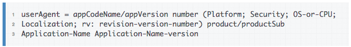
When my index.html loads my mobile.js file, it gets the userAgent string and check against some RegEx's to look for tell-tale signs of mobile users:
var userAgent = navigator.userAgent;
var isMobile = false;

if ( userAgent.match( /Android|iPhone|iPad|Mobile/ ) !== null ) {
  isMobile = true;
}

if ( isMobile ) {
    // Change some CSS...
}
In addition to doing my own testing, I found this handy list of most common user agents and filtered for mobile flags.
In Summary
1) More people need to know about navigation.userAgent. I found a lot of Stack Overflow answers which discussed media queries, but none led me to this method.
2) Don't shy away from Javascript if it's the right tool for the job!
3) When designing user interactions, cool isn't always easily replicatable for all of the devices in today's world!